Dot.vu - Quiz Templates
About the Project
I designed several lead generation quiz templates. They are used as embeds on websites to serve different companies as marketing tools. All templates are customizable and can be tailored to different industries if the user flows allow it.
Duration
11 months and counting, working on Consumer side,
Government side and Branding
Design Challenge
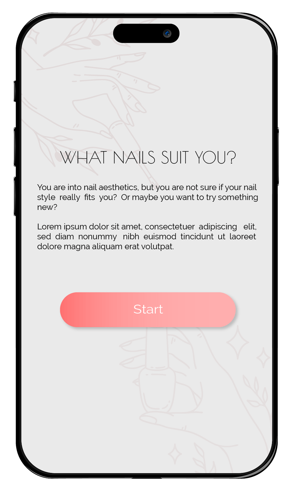
Create themed customizable templates for lead generation quizzes that help companies offer their services and spread brand awareness.
My Role
UX / UI Designer

Case Description

Value, Methods, Tools

user stories

user journey maps

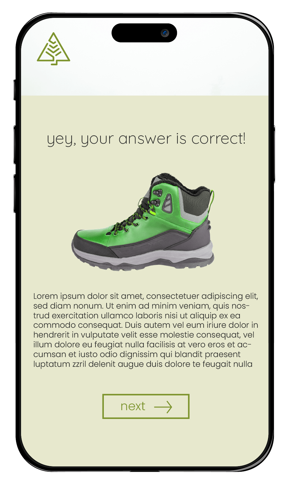
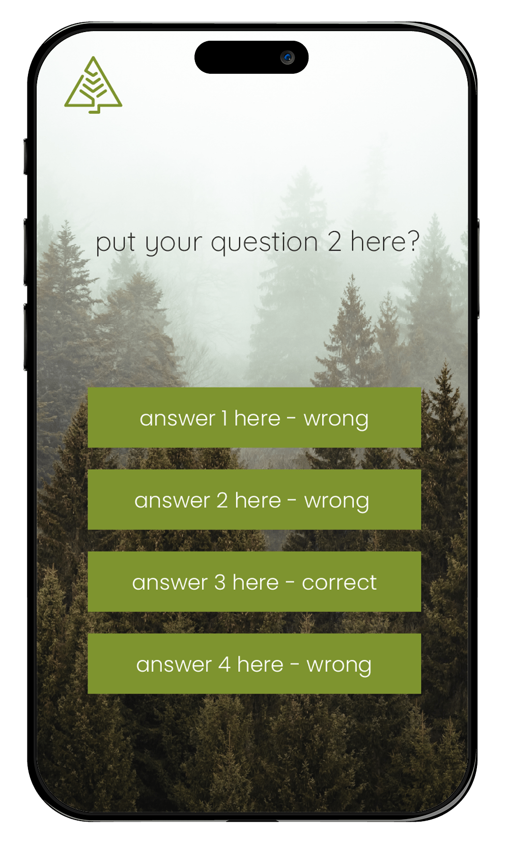
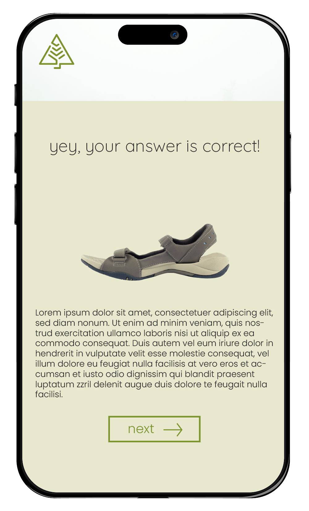
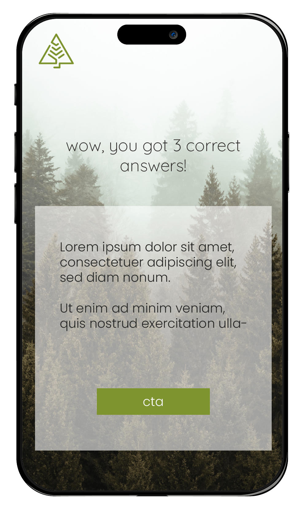
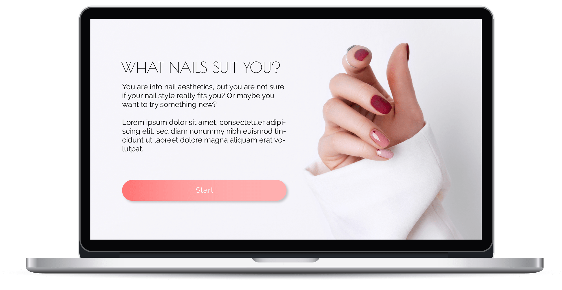
Design Solution - sport equipment quiz
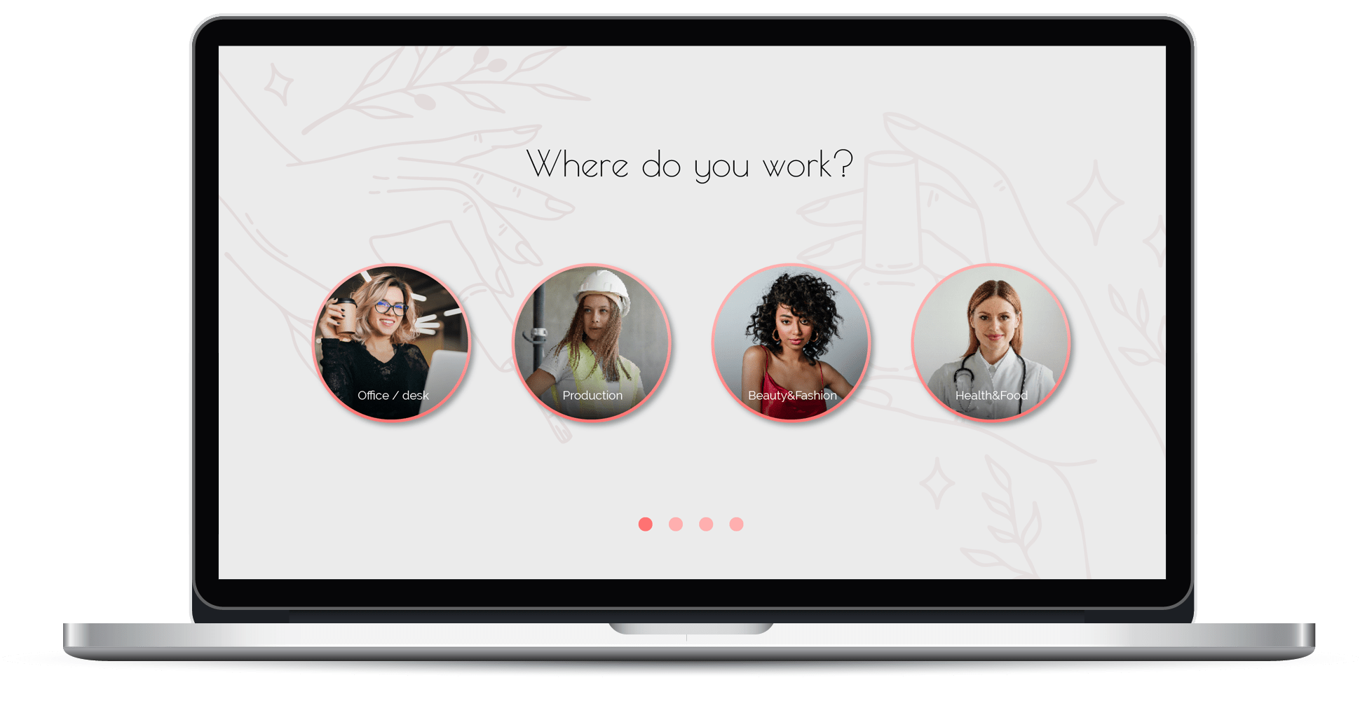
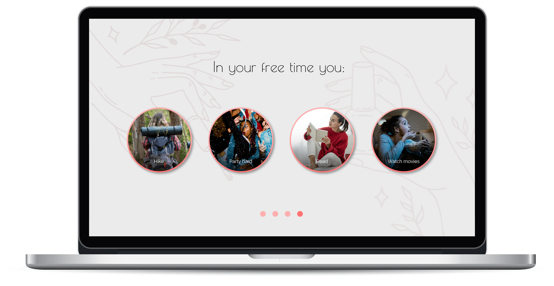
Design Solution - beauty quiz

What I Learned
Case Description
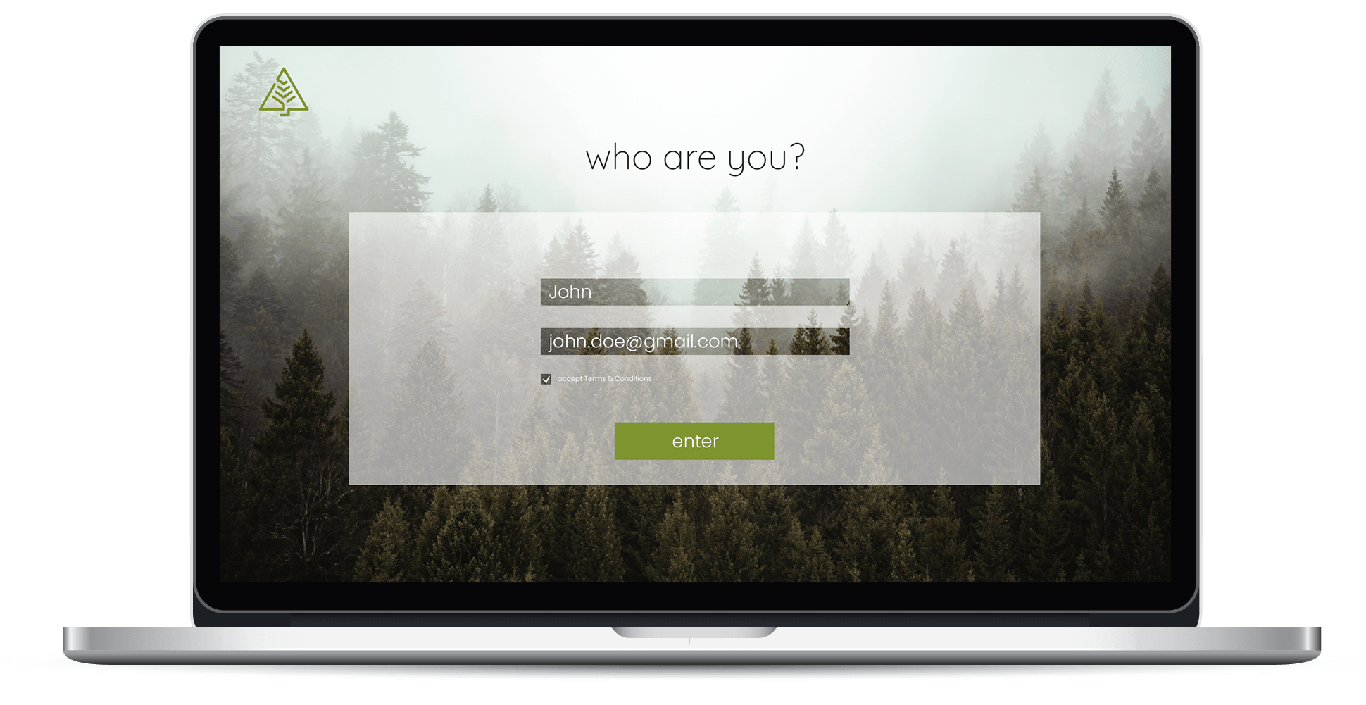
Dot.vu is a platform that offers interactive content for marketing that’s to be embedded on customer’s website. One branch of tools the company creates is interactive quiz templates. The quizzes help their customers generate leads for a their business by offering a personalized result or recommendation based on the quiz taker’s answers. They also increase website’s traffic and user engagement, as quizzes are fun, interactive, and shareable; create email lists, offer useful recommendations, etc.
These templates are customizable – customers can change colors, images, number of questions, text and call-to-actions.
I was assigned with creating several quiz templates. One of the templates I present here focuses on brand engagement and product recommendation. The second one focuses on selling, as it ends with the possibility of booking an appointment.
Value Proposition
- Fun and engaging interactive brand experience for the end user
- Brand awareness – sharable quizzes
- Increases website traffic
- Creates email lists for marketing purposes
Methods
- User stories
- Focus on a specific business goal – fx more appointment bookings
- User journey map
- Modular UI design – allowing customization and personalization of the templates
Tools
- Figma
- Customer Journey Map (Figma plugin)
- Photoshop – for photo editing
User Stories
To understand how the user engagement with the brand and quiz would be, I worked with user stories together with the team lead.
Sport equipment quiz - User Story
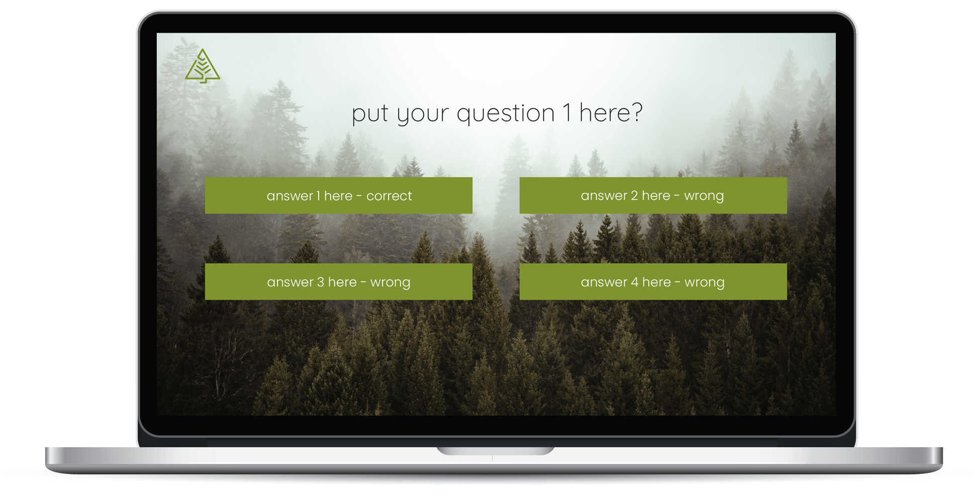
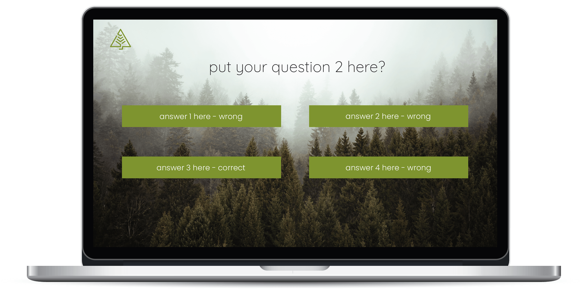
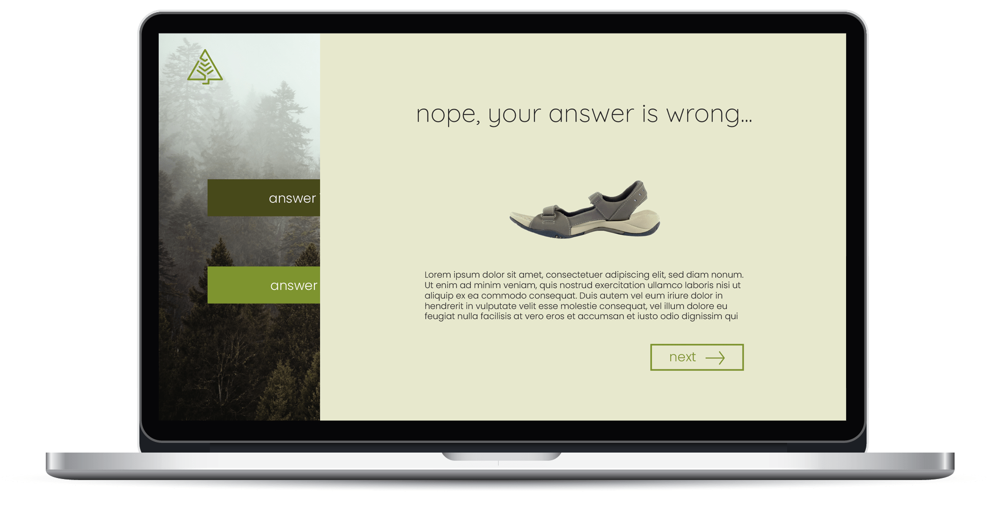
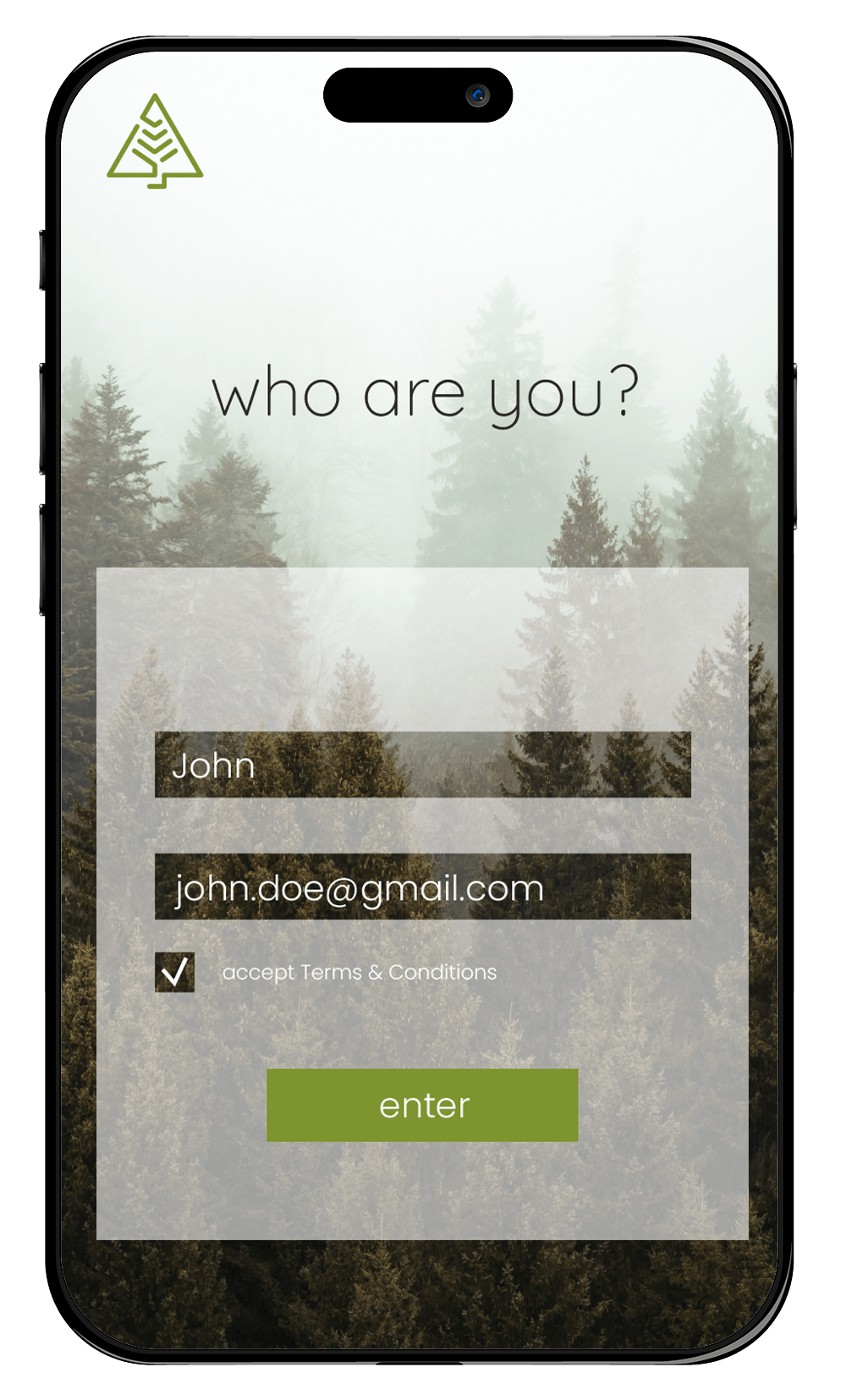
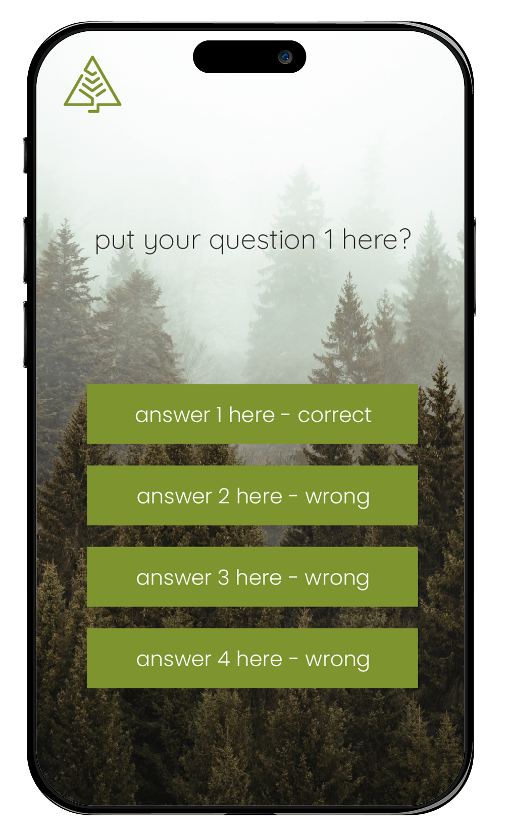
As a user who is looking for sneakers for hiking, Jacob wants to test his knowledge and learn some tips about choosing the right sneakers. He visits a website that sells sneakers and sees a quiz that challenges him to answer some questions about hiking footwear. He decides to take the quiz, hoping to have some fun and improve his knowledge.
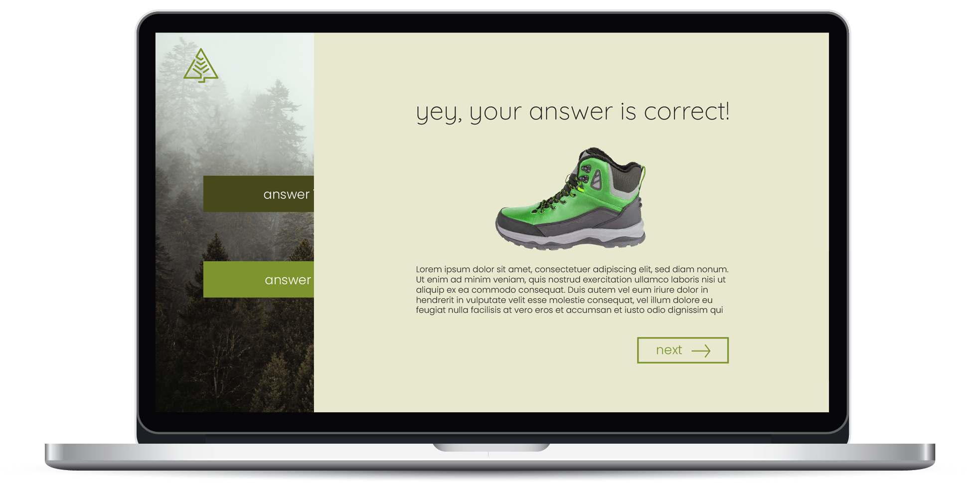
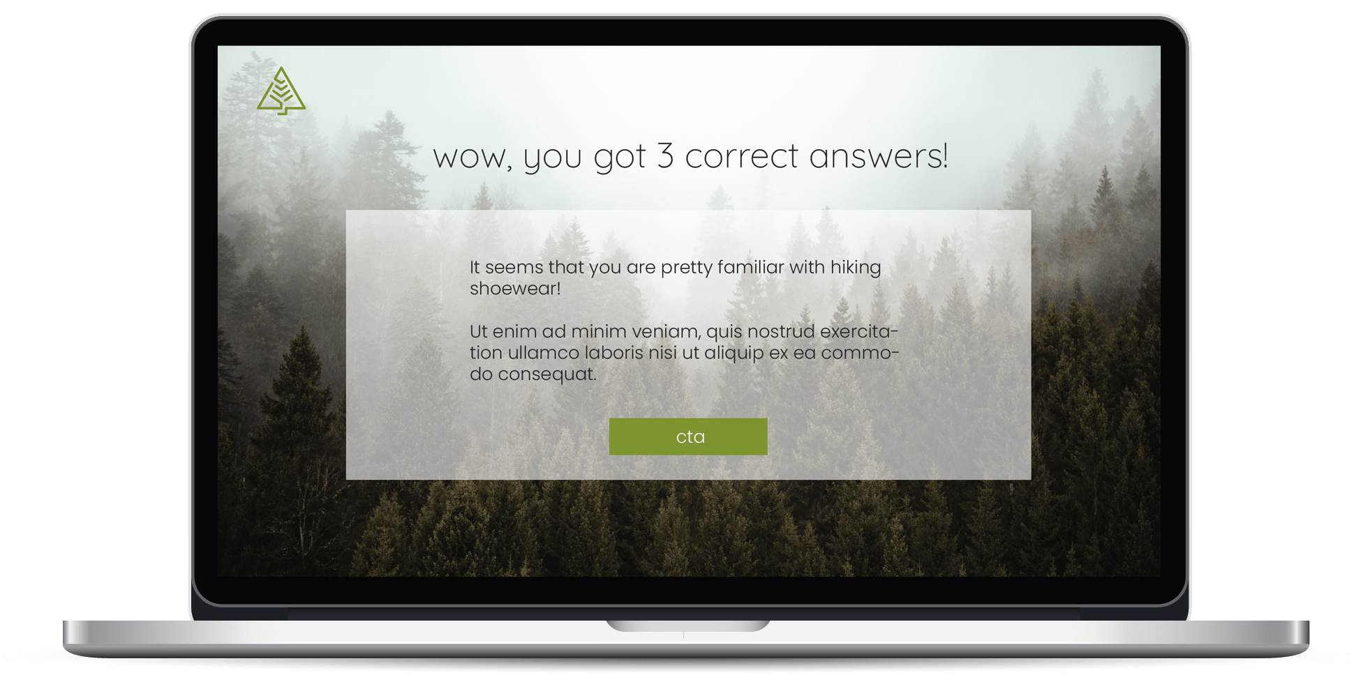
The quiz asks him a series of questions about hiking sneakers, such as what are the main features to look for, what are the common mistakes to avoid, and what are the best brands and models to consider. Jacob answers the questions as best as he can, and the quiz gives him immediate feedback on whether he is right or wrong. The quiz also provides him with some explanations and suggestions based on his answers. After completing the quiz, Jacob is presented with a clear and compelling call to action.
Jacob is satisfied with his quiz score, which shows that he has a good understanding of hiking sneakers. He also learned some new things from the quiz, and he feels more confident and prepared to choose the right sneakers for his hiking adventures. He clicks on the call to action button and is taken to a booking page, where he can schedule a consultation with a sneaker expert or place an order for the sneakers. Now he feels more confident to choose what sneakers he wants to buy. He later places an order with the company. He receives a confirmation email with the details of his purchase and a link to the company’s website.
Jacob is happy with his experience with the quiz, and he feels that the company offers him quality and value. He is excited to receive his sneakers, and he hopes to enjoy his hiking endeavors. He also shares his quiz score with his friends on social media, and challenges them to take the quiz as well.
Beauty quiz - User Story
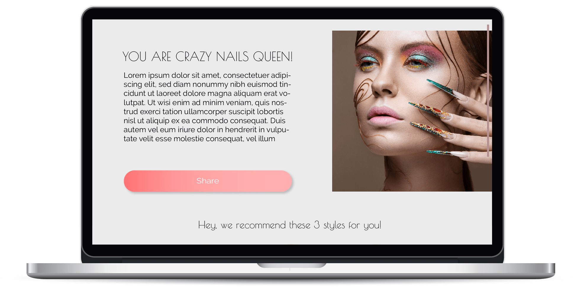
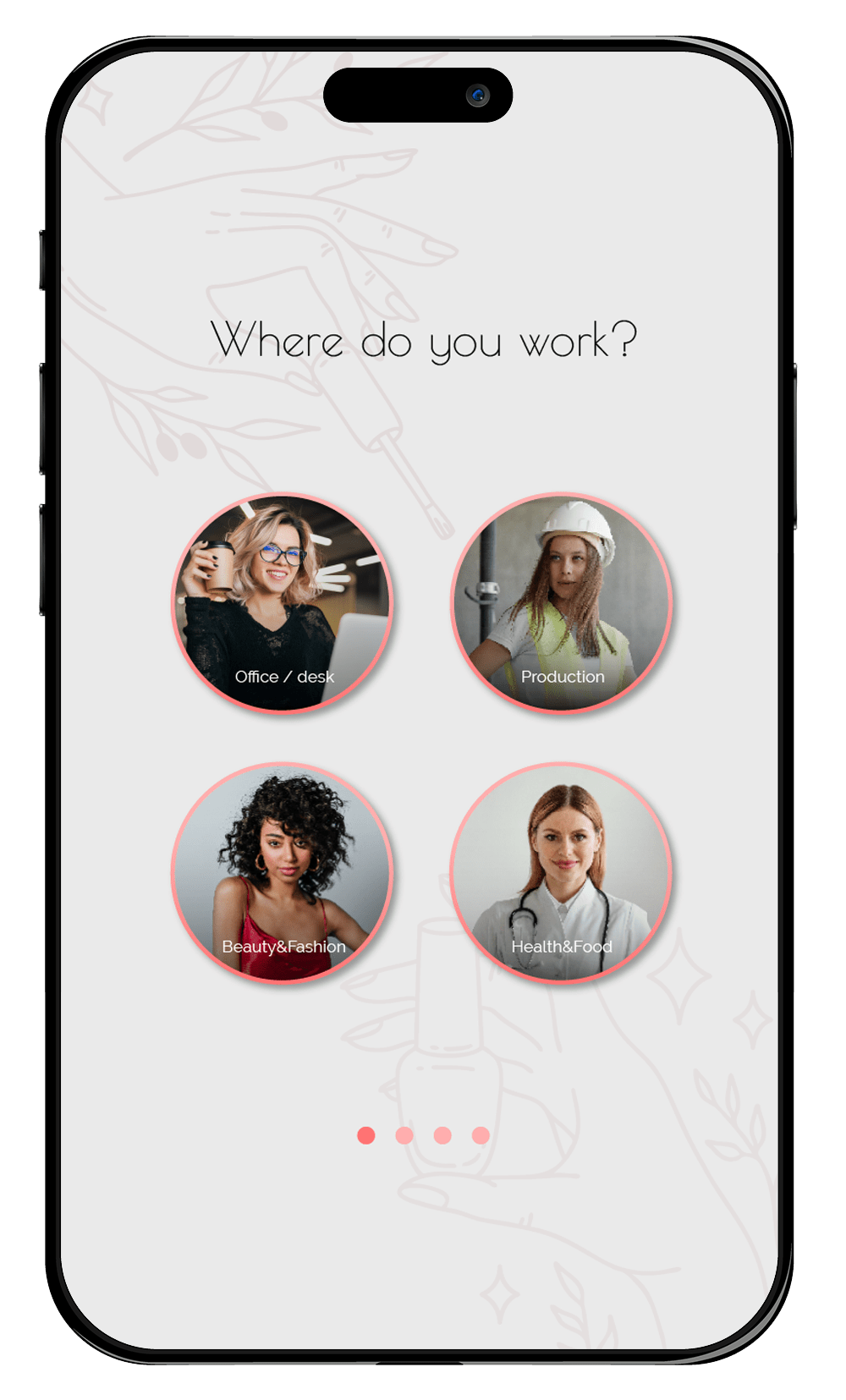
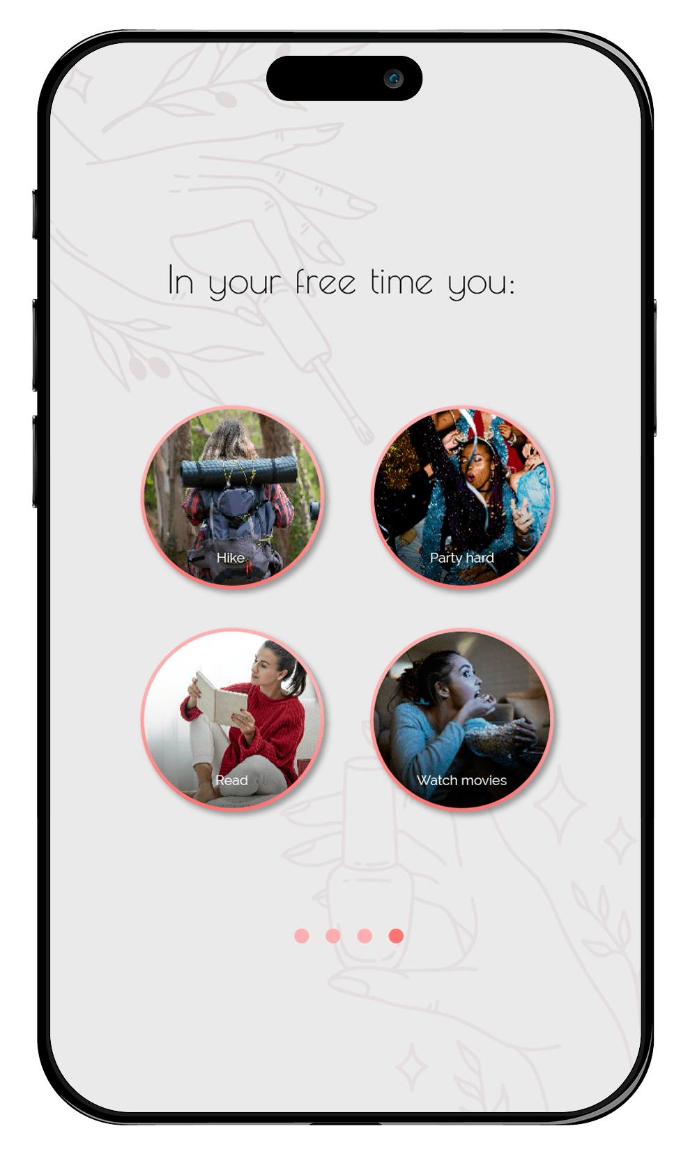
Anna recently got into nail decoration and decided to go to a nail technician to get her nails done. She wants to find out what kind of nails would suit her best. While browsing the Internet to find a saloon, she visits a website that offers nail services. On the website she comes across a quiz that asks her about her lifestyle. She takes the quiz, hoping to discover nail styles and advice that match her preferences and needs.
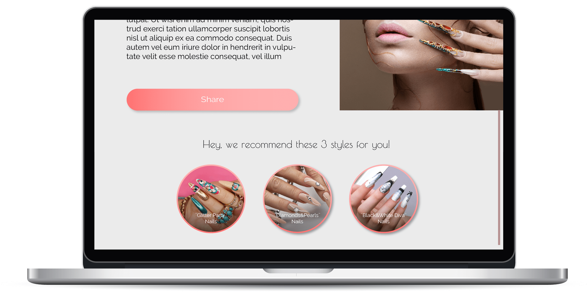
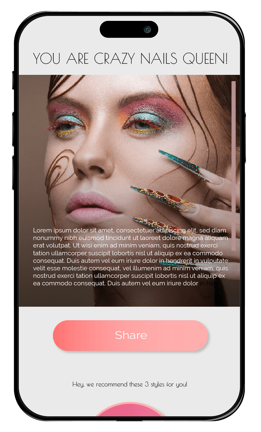
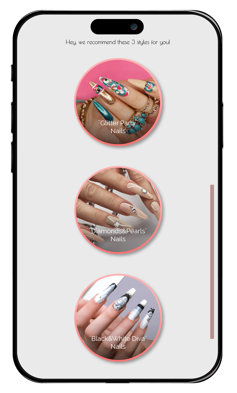
The quiz consists of a couple of questions about her style, for example what does she work, what are the activities she does regularly, and what are the colors and styles she likes. Anna answers the questions honestly. After completing the quiz, Anna is presented with the category of nails that would suit her best, as well as with 3 styles within that category that she can choose from. Style thumbnails are call to action.
Anna is delighted by her quiz result, which shows that she has a preference for long colorful nails, as she agrees they would match her eccentric personality. She also learned some new things from the quiz, such as how to care for her nails, what to avoid when choosing a nail technician, and what are the latest trends and innovations in nail art.
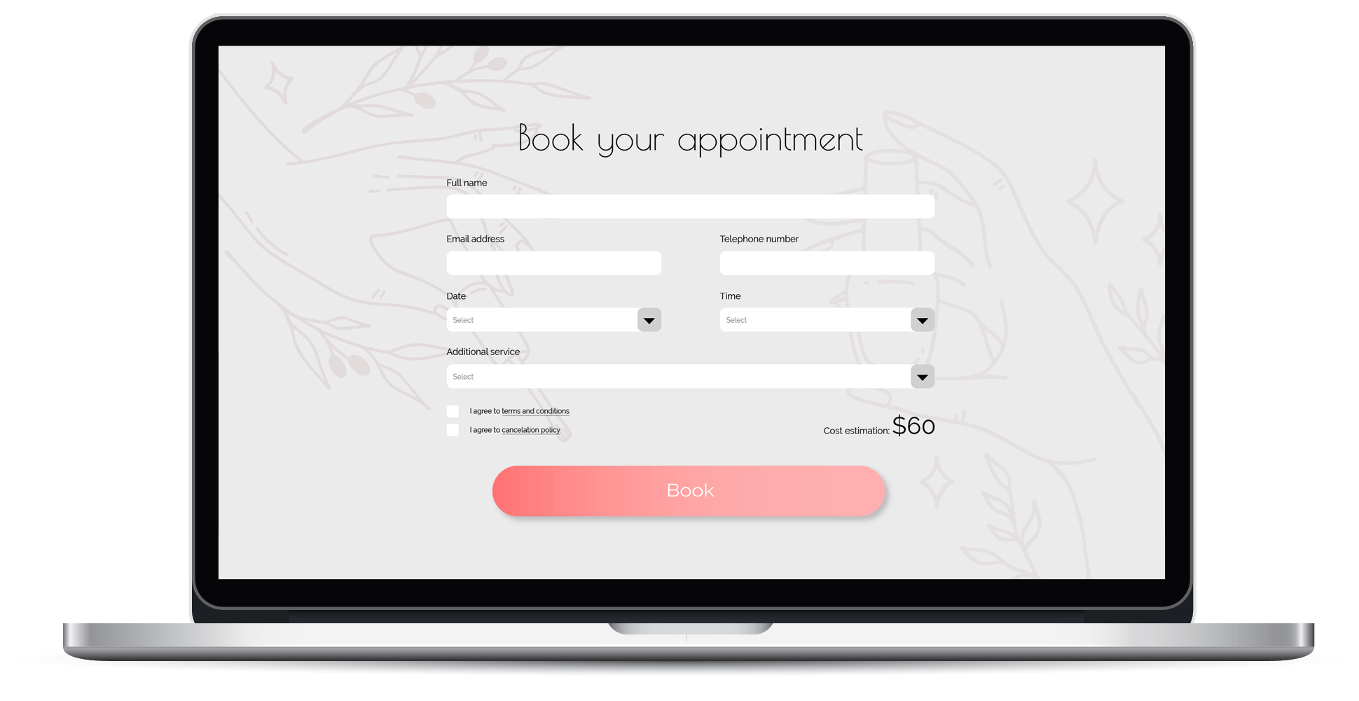
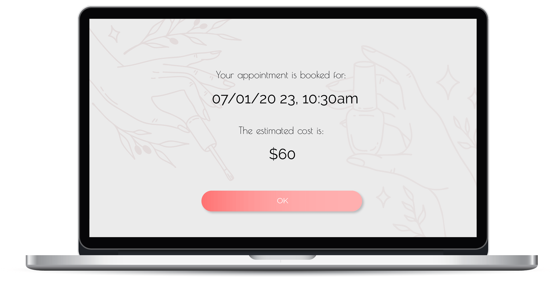
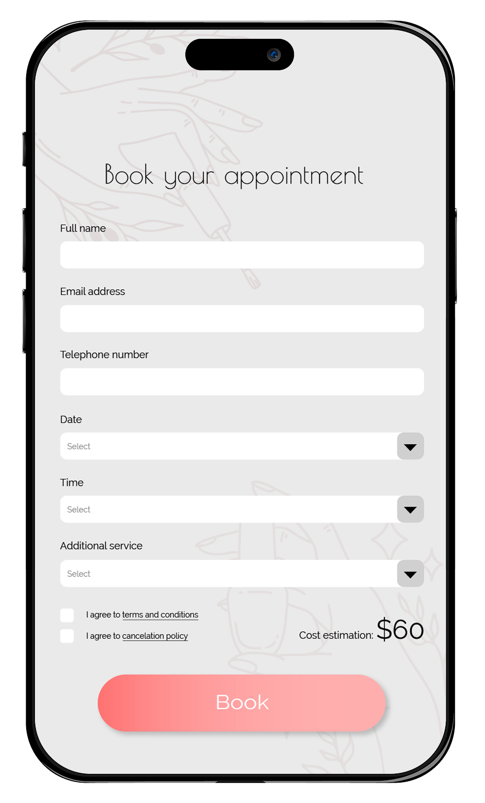
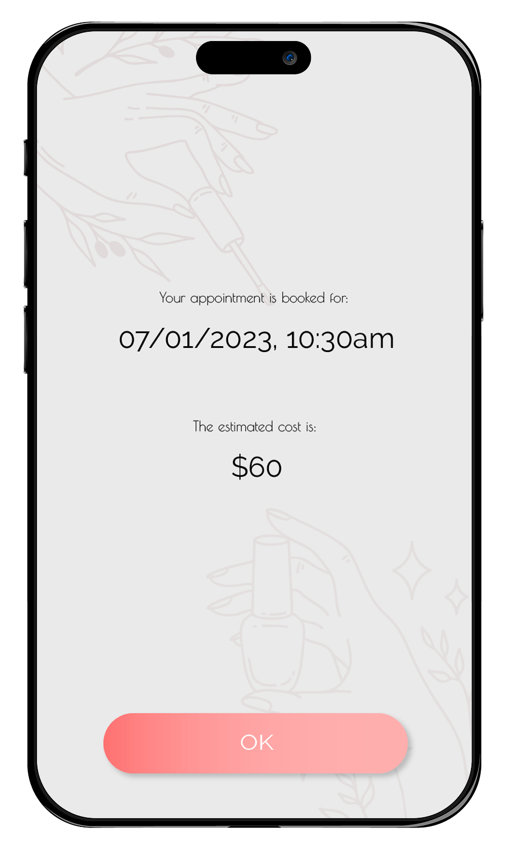
Anna is impressed by the quality and look of the nail designs, and she feels that the website offers her convenience and value. She chooses one of the three designs, and she is directed to a booking page, where she can schedule an appointment with a nail technician. She confirms her booking. She receives a confirmation email with the details of her appointment and a link to the website.
Anna is happy with her experience with the quiz, and she feels that the website understands her needs and wants. She is excited to get her nails done, and she hopes to enjoy her new look. She also shares her quiz result with her friends on social media, and invites them to take the quiz as well.
User Journey Maps
Since the templates I needed to create could be in different scenarios and industries with the end user, I couldn’t rely on more data to work with. I couldn’t prove a hypothesis either but I could at least try to envision how would a user feel when interacting with the quizzes. Hence, I decided to use user journey maps to hypothesize on user emotions and satisfaction.

Design Solution - Sport equipment quiz


Style Guide
Color Palette
#7E942F
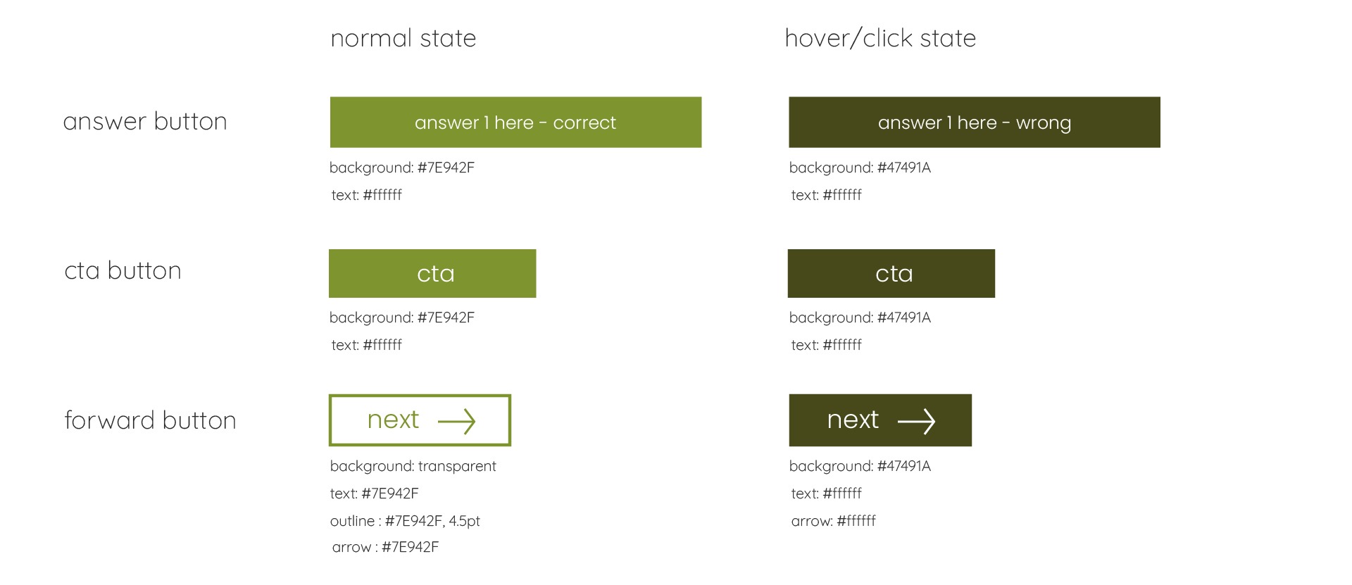
Forest Green is the primary color used in CTAs’ normal state.
#47491A
Dark Green is a variation of the primary color, used for hover and clicked state of CTA buttons.
#FFFFFF
Solid white is used for button text and input fields’ text.
#E7E8CD
Smoky Yellow is the secondary color, used in slide in animation backgrounds that show the answer.
#282828
Blue-black is used for body text and headlines/questions.
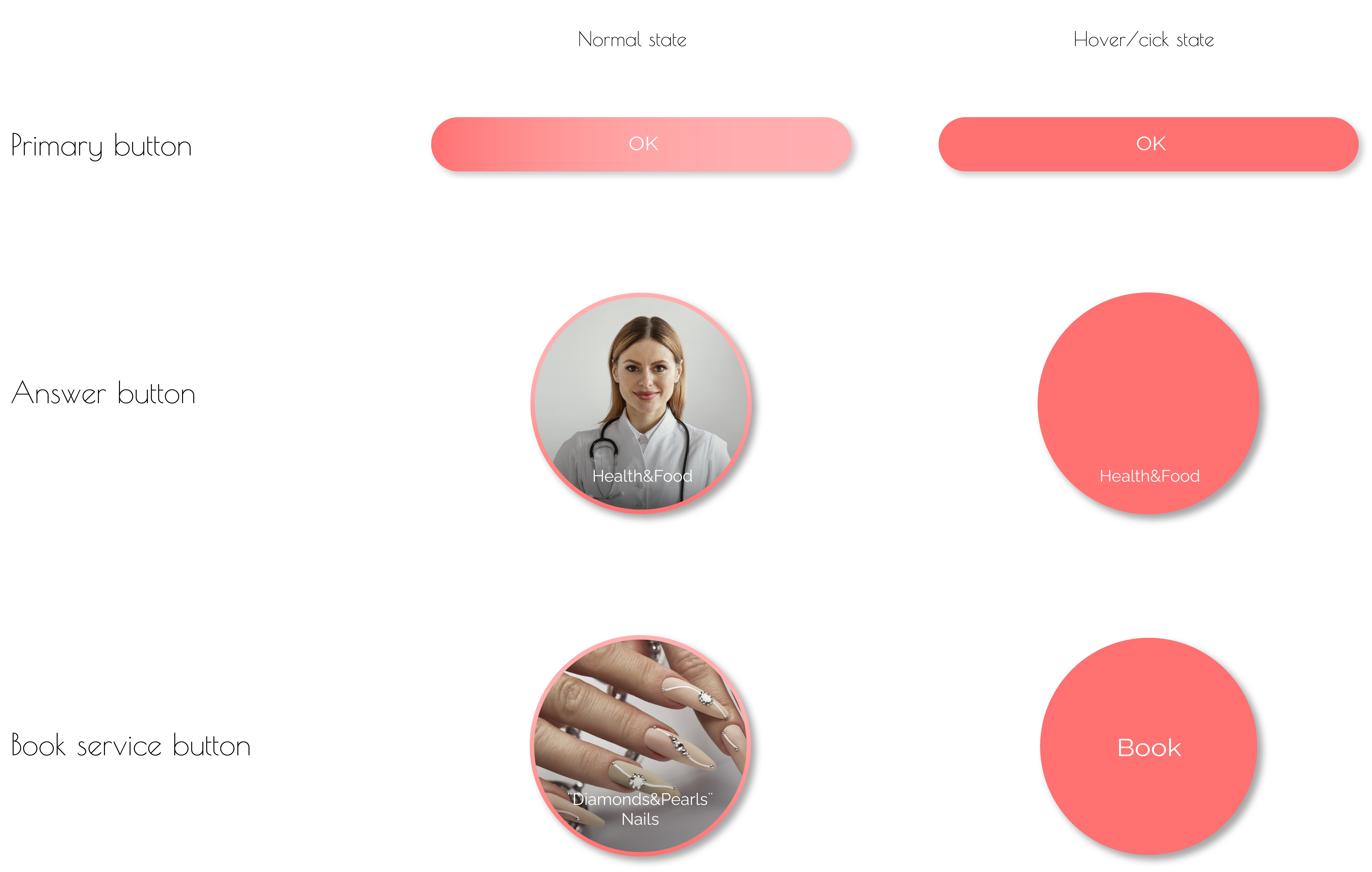
Button Styles
Typography
Aa
Quicksand Light – For headlines
Light
Aa Bb Cc Dd Ee Ff Gg Hh Ii Jj Kk Ll Mm Oo Pp Qq Rr Ss Tt Uu Vv Ww Xx Yy Zz Ææ Øø Åå
Aa
Poppins Light – For headlines
Light
Aa Bb Cc Dd Ee Ff Gg Hh Ii Jj Kk Ll Mm Oo Pp Qq Rr Ss Tt Uu Vv Ww Xx Yy Zz Ææ Øø Åå
Design Solution - Beauty quiz
Style Guide
Color Palette
#FFAFAF
Petals Pink is the primary color used in CTAs’ normal state and in gradients.
#FF7171
Peach Pink is a variation of the primary color, used for hover and clicked state of CTA buttons, and in gradients.
#EBEBEB
Light Grey is a secondary color, used for backgrounds.
#000000
Solid Black is used for headlines, body text and input text.
#FFFFFF
Solid white is used for button text.
Button Styles
Typography
Aa
Poiret One Regular – For headlines and accent
Regular
Aa Bb Cc Dd Ee Ff Gg Hh Ii Jj Kk Ll Mm Oo Pp Qq Rr Ss Tt Uu Vv Ww Xx Yy Zz Ææ Øø Åå
Aa
Raleway Regular – For body text and button text
Regular
Aa Bb Cc Dd Ee Ff Gg Hh Ii Jj Kk Ll Mm Oo Pp Qq Rr Ss Tt Uu Vv Ww Xx Yy Zz Ææ Øø Åå
What I learned doing this project
This project was a great opportunity for me to learn and improve my skills as a user interface designer. I learned how to create templates, how to design components that are customizable, how to work without a brand identity in place, and how to create a UI that speaks about the topic of the template through colors and shapes. Working with developers was a valuable experience, as I improved my communication with them, which helps my design ideas and decisions effectively. I got better in receiving and incorporating feedback from them.
Creating templates was a challenging and rewarding task, as I learned how to design for different types of content and users, and how to make the templates adaptable and reusable.
Working without a brand identity in place was a creative and fun exercise, as I learned how to use the UI elements to convey the message and personality of the template. I learned how to use colors and shapes to create contrast, harmony, and emotion, and how to choose the right colors and shapes for the topic of the template. For example, I used warm and bright colors and organic shapes for the beauty quiz template. That style gives follows the keywords warmth, fun, girly, fashion. I used more dim and dark colors and geometric shapes for a the sport equipment quiz template. That style talks about mountain hike, speed, direction.
Creating a UI that speaks about the topic of the template was an important and satisfying goal, as I learned how to design for different resolutions and devices, and how to make the UI responsive and accessible. I bettered my skills in using grids and breakpoints to create a consistent and flexible UI. I also worked a lot with contrast and typography to make the UI accessible and inclusive.
This project was a great learning experience for me, and I became a better UI designer because of it.
Thank you for your time and attention.