HeliosHuse
About the Project
HeliosHuse branding and website: https://www.helioshuse.dk/
Client
HeliosHuse
Duration
2 months
Design Challenge
Create digital space where home buyers from Denmark find trustworthy and smooth home buying experience.
My Role
UX / UI Design / Branding – Free-lance designer

Case Description

Value, Methods, Tools
Logo and Branding

Design Solution

What I Learned
Case Description
At around 30-35 years old, Danes buy theirs first or second homes. Many go for family houses as they have or are about to have children. One of the most wanted qualities of a house are high energy class and uniqueness, tailored to families’ needs, supported by modern design. This is what my client HeliosHuse offers. That is also the information that users need to find throughout their journey on the website.
HeliosHuse is an architectural and construction company with solid experience from previous architect businesses they owned. Knowing their Target Audience well, the newly created company needed up to date digital presence that supports their customers throughout the whole months-long cycle.
This project started from creating the face of the company – their logo and brand identity, and went through wireframes and mockups. I worked on the project together with a web developer. He built the website in WordPress afterwards.
All data regarding Personas and User journey is provided by the company.
Value
Recognizable on the market
Effective end-to-end customer experience
Trust building experience
Methods
Competitors analysis
Low fidelity prototyping
High fidelity prototyping
Logo, Branding
Agile approach
Project management
Tools
Hand sketching
Adobe Illustrator
Figma
I started with Branding
Color palette in this projects is based on the word “sun” (Greek – “Helios” in the company’s name). It represents the concept of sunny, warm, luxury houses the company builds. To match the concept, I chose the “Helios Gold” color inspired by Pantone Old Gold color.
My approach on the logo included a lot of brainstorming, sketches and workshops with the client. I outlined patterns in the initial logo sketches using card sorting and user testing. That process led me to finding a direction for the final logo design. Four variations were outlined and all of them had the house symbol in it. Thus I confirmed the hypothesis that a simple representation of a house symbol is bulletproof in our case.
When sorting, I aimed at:
- Recognizability of symbols and shapes
- Scalability
- Suitable color palette
- Finding the right visual center
Design System
Color Palette
#CF962A
“Helios Gold” represents the sunny, warm, luxury houses that the company builds. It is primary color used in logo, CTA buttons and interactive illustrations.
#EEAA3B
“Helios Gold” Light is a variation of the primary color, used in CTA buttons and interactive illustrations.
#555555
Dark grey is used for headlines.
#949494
Light grey is used to add harmony and additional warmth to the brand. It is used for body text and subheadlines.
#FFFFFF
Solid white as background helps the design represent spacious the houses. It also gives creates contrast and helps the minimalistic design.
Typography
Aa
Montserrat – For headlines and accent text
Aa Bb Cc Dd Ee Ff Gg Hh Ii Jj Kk Ll Mm Oo Pp Qq Rr Ss Tt Uu Vv Ww Xx Yy Zz Ææ Øø Åå
Aa
Roboto – For body text
Aa Bb Cc Dd Ee Ff Gg Hh Ii Jj Kk Ll Mm Oo Pp Qq Rr Ss Tt Uu Vv Ww Xx Yy Zz Ææ Øø Åå
Design Solution
Finding the Main User Flows
Information about the user – motivations, Persona and user objectives were provided by the company. I did competitors research that helped me shape the user flows. Based on that information, I hypothesized about features and tested hand-sketched wireframes. They were well perceived by user testers. The key user objectives and features helping them solve their problem were confirmed – people were looking into:
- Finding clear information about price.
- Knowing the values and parameters the house offers, using technical drawings and 3D visualizations of future homes.
- Knowing the energy class.
- Knowing the process of buying.
- Looking through a portfolio with possible design solutions for their new house.
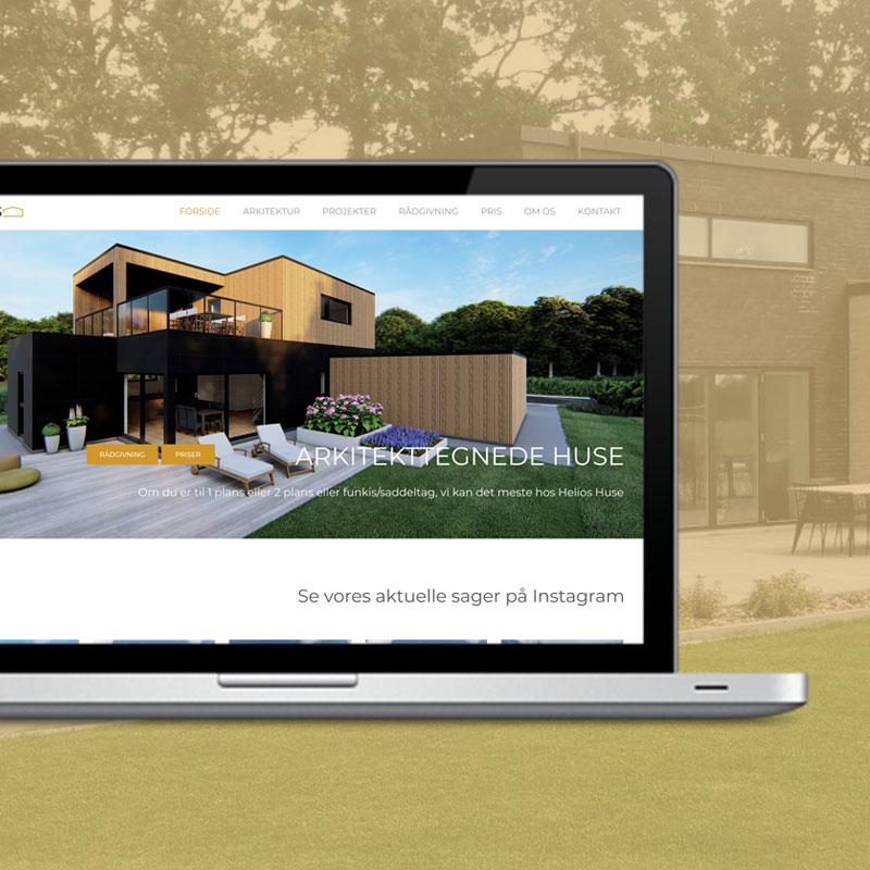
All those can be found in tabs: Arkitektur, Projekter, Rådgivning, Pris. There are additional easily accessible sections, like “3D VISUALISERING”, “PROCES BESKRIVELSE” and “KATALOG” found on the home page.

Testing and Conclusion
After the final mockups were done, I tested the website on the target audience – 30-35 years old Danes with families. All users could find price, parameters, photos and other details they were interested in easily. The design successfully fulfills user need of a digital space where they can smooth home buying experience. They liked the sleek design and easy navigation.
You can visit the website at: www.helioshuse.dk
What I learned
I was creative in the way I used tools. For example, I got inspiration from the UX method Card sorting and used it similarly on grouping and evaluating logo designs. That gave me new points of view and showed once again that design process is flexible. The agile process where several in-between-test were done, together with a constant discussion with the company, confirmed that flexibility as well. I enjoyed this process a lot.
The communication between me and the web developer and the company was very thorough. We used several channels – phone calls, chat, screen sharing, live meetings. All that required time and resource management. That situation strengthened my project management skills. I was not only a designer but also planning the communication with my colleague and stakeholders.