Vipps MobilePay - Group Payments
About the Project
This personal project is a result of my curiosity and passion for simple and seamless fintech solutions. I did it to improve my skills in mobile UI design and to propose a new way to split and share group payments.
Duration
11 months and counting, working on Consumer side,
Government side and Branding
Design Challenge
Create a quick and straightforward way to split and share costs among people with no need of calculating everyone’s share of the bill.
My Role
UX / UI Designer

Case Description

Value, Methods, Tools

Research and Hypothesis

Into Users' Shoes

Design Solution

What I Learned
Case Description
The Danish mobile payment company MobilePay merged with their Norwegian competitor Vipps in 2022. In 2023 they still have two separate apps on the two markets – MobilePay for Danish users and Vipps for Norwegian users. Both apps offer very similar approach to fast and easy mobile payment but they of course have some differences in features and still have different brand identities. As the newly formed partnership is yet to further develop and merge their mobile payment solutions.
After visiting a workshop on that topic, held by the company, I got inspired to work on my proposal for a feature that allows users to deal with group payments in a quick, fair and transparent way, without the hustle to calculate amounts on their own.
Value Proposition
- No more calculating and requesting money separately
- Fairness and transparency
- Accuracy – no need to remember the bill
- No steep learning curve
Methods
- Desk research
- Test on both apps – Vipps and MobilePay
- Hypothesys
- User interviews
- Testing user scenarios
- Wireframe sketching
- Mockups
- User testing of final solution
Tools
- Hand sketching
- Figma
Research and Hypothesis
Reaching out to Norwegian users
To understand how can I get the best of both apps – Vipps and MobilePay, and enhance what is already there or find new ways to simplify even further the experience, I needed to know them both very well as well as talk to users. MobilePay is an app that we, people living in Denmark use on a daily basis. With Vipps though I needed to be more creative.
So far MobilePay does not have a group payment feature. When users do group payments, they calculate the amount they need to pay separately in an external calculator app. Vipps has gone further in that experience, offering a calculator feature over the standard keyboard right before the user proceeds to sending money to another user.
I have noticed the confusing interface of the calculator feature that often leads to incorrect calculations when several equations need to be done one after another.
To explore this, I reached out to Norwegian users and asked them to perform tasks in Vipps and comment on their steps, on the results, and to show me screenshots of the process.
The first task was to use calculator in the scenario of adding the price for a burger in a restaurant (150 nok) and soda (50 nok) and divide the bill by two people.
Results were showing that in order to get the right result, users must press equals after every mathematical operation because calculator has no brackets, which are needed in a case like this. That made participants impatient and frustrated. A couple of them mentioned that they never used this calculator before anyways.

The second task was to walk me through the scenario of how they pay for their consumption in a shared bill. Two main approaches were:
- everybody is calculating their amount using the default calculator app on their phone and then send the money to the one who paid the whole bill
- the one who paid the bill calculates the separate amounts and sends money requests to everybody
Hypothesis
Based on this feedback, I hypothesized that there is a need for a more user-friendly and intuitive way to split bills among group of people.
By enabling users to divide bills easily among their group members based on their individual consumption, the feature will reduce hassle, save time and effort, and increase satisfaction.
Research on Technology
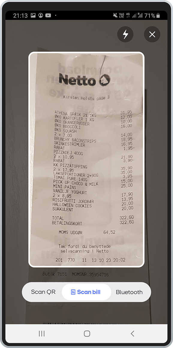
I got the idea that digitizing the bill with smart scan will solve the need of remembering the bill or calculating individual amounts right away after getting the bill. Furthermore, if the digitized bill was interactive, people would be able to add or substract their items from the bill with a simple tap. Next step was to research on smart scan and interactive items lists, to be sure how existing technology would play its part in my idea for a solution.
Smart scan is a well known technology that uses the camera on user’s phone to recognizes and digitizes all information from the source it is pointed at. There are plenty of apps that do this, including apps that scan receipts. Result of my research on the topic shows that:
- some apps offer just a digital copy of the receipt for bookkeeping purposes. Disadvantage: no interactivity in the digitized receipt
- some apps, like Vipps, offer smart scan for paying total amount of an invoice. Disadvantage: no possibility of splitting sums
- no app offers possibility to interact separately with items from the list after digitizing the receipt
When researching on group payments, I found apps that offer Split&Share in different ways. Main findings were :
- some apps required manual input of amounts, like Vipps app fx. Disadvantage: users still need to calculate their shares beforehand
- some apps work only with digital receipts. Disadvantage: useless for paper receipts
- most apps ask payer of the whole bill to split it amongst others. Disadvantage: this approach charges payer with the responsibility to remember everybody’s consumption, calculate their shares and prepare individual money requests.
After I found areas of improvement in the existing apps from my research, I used this information to further develop my concept into an app that allows users to deal with group payments faster and easier.
Stepping into Users shoes...
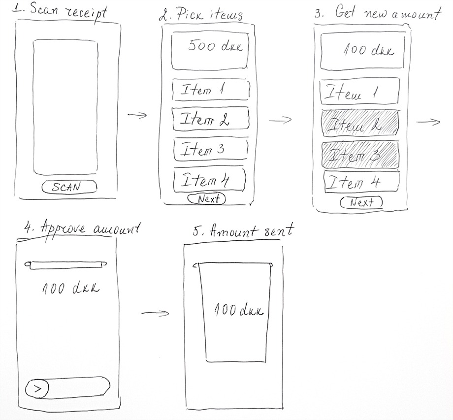
Proof of Concept
I created a wireframe to test the concept of the new feature. I presented users with two scenarios – The Payer and The Debtor. I used the same wireframe without giving more detail to users to see how would they interact with it, following the screens and the scenarios I told them. I tested 10 users this way to seek whether my concepts lives up to the simplicity both MobilePay and Vipps apps offer.
User flow 1: The Payer
Step 1.The person who’s paid the whole bill, scans the paper receipt.
Step 2: She gets the newly digitized interactive receipt.
(Step 2.2 – Optional: She extracts her own consumption by tapping on her food and drinks from the list.)
Step 3: Then chooses recipients from her contacts – as it is normally done in MobilePay.
Step 4: She sends the receipt to those recipients.
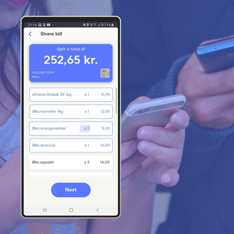
User flow 2: The Debtor
Step 1: The person who owes The Payer money receives the digitized receipt.
Step 2: He adds his consumption by tapping on his food and drinks from the list in the digitized interactive receipt. He can edit number of items if he owes money for just one out of 3 pizzas, for example.
Step 3: He approves the sum as it is normally done in MobilePay.
Feedback:
Both user flows were evaluated as very quick and handy by test participants. Value points users appreciated highly: easy, no hustle, no need to remember numbers, no need to calculate, quick to tap, similar to well known MobilePay send and request flows.
Design Solution
New Split & Share Feature
After confirmation that a Split&Share feature designed this way would satisfy and enable users to deal faster with group payments, I created the user interface. What I took into consideration was MobilePay’s design system. I used all brand guide materials available for download on their website. I also paid close attention to details in their app, such as round corners, drop shadows, font sizes, naming conventions, button sizes, negative space and animations.
Payer’s Flow:


Debtor’s Flow:


Final Testing
After concept was proved and UI was created, I tested the final look of the new feature. It was confirmed that look and feel matches MobilePay’s brand identity and simplicity.
What I learned doing this project
Working on this project has been a valuable learning experience for me. I got better in working with design system and established brand identity, which helped me to create a consistent and appealing visual style for the product. I also got better in finding possible pitfalls in a feature, such as usability issues and user feedback. I got better in designing for mobile and fintech, which are two of the most important and challenging domains in the current market. I focused on creating simple, intuitive user flows in mobile, which enabled the users to perform their tasks easily and securely. This project has improved my skills and confidence as a UX/UI designer. I enjoyed the challenge and I look forward to applying what I’ve learned to future projects.