VRpilot - UX / UI, Redesign, Branding
About the Project
VRpilot – https://vrpilot.aero/
Duration
2 months
Design Challenge
Ease the user journey of VRpilot training VR app and website.
Create consistent cross-platform brand identity.
My Role
UX / UI designer
Brand designer

Case Description

Value, Methods, Tools
Evaluation of design

My Approach

Design Solution

What I Learned

What Colleagues Say About Me
Case Description
Information - Heavy experiences
Target Audience of this app – pilots – train all their life, even when they are seniors in their professional career. Virtual reality (VR) is adding value to all the stages of training. The Danish company VRpilot produces virtual reality flight training applications, tailored to different aircrafts, which help pilots with higher level of comprehension. These VR apps use virtual cockpits and thus allow pilots and students to experience specific training challenges without having access to real aircraft.
These VR experiences needed UI redesign – colors, structure. User flows needed to be more simple and smooth to ease the learning process that is typically tech and information heavy.
Brand needed consistency as their design language was not well defined. The website had too much text, user flows needed optimization and more interactive and visual elements.
Value
Optimized user flows and UI for better user experience (VR app)
Improved readability, easy on the eye design and colors (VR app)
Optimized user flows, UI and visualization of content (website)
Design system created
Cross platform brand consistency
Mehods
Desk research
Field research
Empathizing with user
Low and high fidelity prototyping
Gestalt laws
Design System and Style Guide
Project management
Tools
Hand sketching
Figma
Adobe Illustrator
Adobe Photoshop
Adobe After Effects
Adobe Media Encoder
VR headset
I started with Evaluation...
User Flows and UI changes
VRpilot contacted me after they gathered user input. Insights were showing need of easier and smoother user flows for their VR training app as well as in their website.
I studies their website and tested two of their VR apps myself to put myself into users’ shoes. That experience helped me understand pain points in the VR app user journeys.
Combining user input and my observations and experiences, key findings were:
VR App
- UI was visually heavy using a combination of very dark grey red.
- Text was too much.
- No sufficient amount of white space.
- Visual hierarchy and placement of buttons was confusing.
- Visual feedback of buttons was confusing.
- UI look was outdated.
- Login in flow was confusing.
- Brand logo appeared in random places.
Website
- Website was too text heavy.
- Website was generally not appealing.
- Missing visuals – icons, illustrations, videos, banners, etc.
- Missing design laws.
- No defined brand identity.
- No design system.
- Random use of different shades of red for a brand color.
- Photo quality was low.
- Call-to-action was either missing or confusing.
My Approach to Redesign...
Research
During the desk research on apps and websites in military and aircraft sector, I researched user flows, journeys and color schemes. Colors in military are specific and needed to be looked upon thoroughly. Regarding VR app flow, I needed to also understand well aircraft procedures pilots need to perform in the app. Since air force apps often deal with huge load of information, I need to look into best practices for lowering cognitive load.
The company shared with me their Pilot Persona.
Regarding the website, I did desk research but also 5 tests on common website users to see how information is perceived, and what is level of user satisfaction.
Changes in structure and alignment
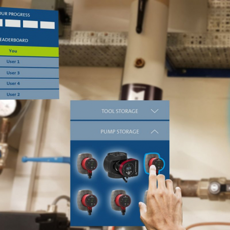
Based on the key findings above, I started redesigning their main VR app first. Website’s design would later follow this design because most important now was to create an easy on the eye design in the VR space.
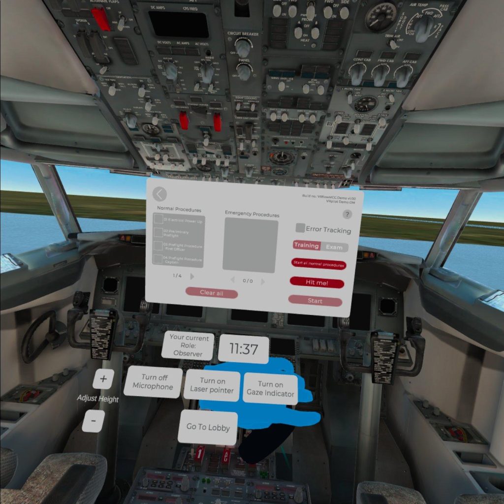
I proposed quick corrections in the way information is organized in the UI. Those were changes in alignment, white space, fonts and shapes of UI elements. After a discussion with the company, new hierarchy and flow was approved and I proceeded further with the redesign. Now main problem remained the heavy colors that blended with the virtual cockpit on the background.
Click on images to zoom in.


Design Solution
New Color and Style
Main user pain points for the VR app revolved around slower process, loss of focus and additional amount of concentration needed, which led to frustration and tired eyes.
Changes in UI I introduced like lighter colors, better contrast and focus on CTA buttons were in help of tired eyes, and also lowered the cognitive load. User flow is smoother and more intuitive. Readability is better. According to best color practices for VR, solid black and solid white are avoided.
I applied the new style to the website as well. I restructured some of the user flows there as well, and introduced icons to lower the amount of text (see design kit below).
After user testing of both VR app and website, my design solution was verified.
Click on images to zoom in.


Design System
COLOR PALETTE
#BB191C
Light Red is the primary color used in logo, icons, CTA buttons and accents.
#5D0C0E
Dark Red is a variation of the primary color, used in icons, CTA buttons and states.
#3C4858
Blue-grey is the secondary color that adds harmony in the color palette. It is used in headlines in the website.
#949494
Dark grey is used for body text in the website.
#FFFFFF
Solid white creates good contrast. It is used as background in the website and in headlines on a busy or dark background both in the website and in the VR app.
#DDDDDD
“VR background” Grey is used for background of all UI windows in the VR apps. It creates a good contrast with the busy 3D environment behind it.
#BCBCBC
Grey is used for sections and elements in the VR UI.
#323437
Black-grey is used for headlines and accent text over the other two grey colors in the VR apps. It avoids eye strain that pure black causes in VR.
Typography
Aa
Exo – For headlines and subheadlines
Bold
Aa Bb Cc Dd Ee Ff Gg Hh Ii Jj Kk Ll Mm Oo Pp Qq Rr Ss Tt Uu Vv Ww Xx Yy Zz Ææ Øø Åå
Aa
Roboto – For body text
Regular
Aa Bb Cc Dd Ee Ff Gg Hh Ii Jj Kk Ll Mm Oo Pp Qq Rr Ss Tt Uu Vv Ww Xx Yy Zz Ææ Øø Åå
SOME OF THE ICONS AND ILLUSTRATIONS
Conclusion
The goal of this redesign was to make the user journey for the VR app and the website easier. Also, to create a cross-platform brand consistency. The company tested my VR app design on the target audience after they implemented it. I tested the website redesign on users. Cognitive overload and difficulties in the user flow were no longer present. User input from tests validates my solution, the problem was solved.
What I learned
This project was a unique opportunity for me to redesign an app for a specific and challenging user journey and target audience. I had to adapt my research approach to the military regulations that prevented me from speaking with the users directly. I learned how to overcome this limitation and understand the user’s needs and goals.
I also improved my decision making skills when reorganizing the UI and structure to enhance the UX. I faced the interesting challenge of working with a lot of text in a VR app, which is uncommon for this type of app. I had to simplify the text as much as possible, without compromising the information and instructions that the users needed. To do this, I immersed myself in the user journey, doing the trainings in the app myself, and identifying what text could be replaced by visuals. I gained a valuable insight into how to balance the amount of information in a VR app.
Another skill that I developed in this project was cross-platform brand consistency. I redesigned the website to match the app, and to create a coherent and seamless experience for the users across different devices and platforms.
What the company says about me
”At VRpilot Elitsa challenged our way of thinking user experience design within our product portfolio. With her likeable personally and analytical approach she managed to give an accurate design analysis of the existing design combined with a tangible implementation plan for future enhancements.”
Daniel Maass
Partner & CEO at VRpilot
Contact: +45 24401485